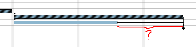
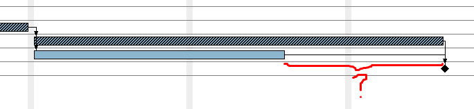
How can I show the time range highlighted in red on a column or in the chart?
Thanks!!
How can I show the time range highlighted in red on a column or in the chart?
Thanks!!
Pardon? Critical path, by definition, includes only those tasks which have zero float.
Yes! What I want to do is to show the delay for other activities that are not critical ones. It is simple to do using Microsoft project. Do you have any idea on how to do this?
Tks man!
Do you need a number indicating the slack value?
Yes!! Exactly this! For management purpose it is very important to has a visual way to see this “allowed delay”.
I see. I have submitted a new enhancement request to the tracker:
Many thanks, man!! Super!
Welll… just to confirm… I guess GP v3 does not show this on the Gantt chart as the wikipedia’s page on Gantt chart does, right?
Black lines in here.
I didn’t do anything about this issue (yet).
It seems like you should be able to create a calculated column to show the slack. It wouldn’t give highlighting, but at least could give the number of days slack. I would create one myself, but I don’t know SQL and don’t have time to learn…
Current implementation of calculated columns is very limited. I don’t think it is possible to calculate the slack that way.
Are calculated columns able to do maths with dates?
Hi Manuel,
Yes, dates functions are supported. Internally, we use H2 database, and all functions supported by H2 should work, provided that you access the attributes of a single task only.
The list of functions is here (scroll to the date functions section).