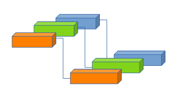
I love your program. Thank you so much. I wish someone would make a 3d version of Gannt. So instead of Gannt charts being multiple pages tall, they could be multiple pages deep (pushed away from the computer screen into the “Z” axis). This way tasks that are happening simultaneously by different resources, don’t have to be on new rows, they could be on new Z-axis layers. I suppose the easy thing to do is make an isometric projection like the simple 2d shapes in the attached image. A more elegant solution might be to do a 3d interface like google sketchup.
Anyway. Thank you so much for GanntProject, and thanks for taking the time to read this. I imagine this idea is already covered by a patent, so I completely understand if this doesn’t go anywhere. I thought I should get this idea out of my head and over to people that might be able to do something about it.
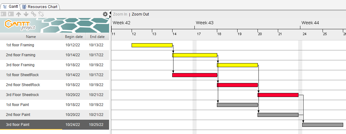
So a normal Gannt chart might look like the image below.
Time goes from left to right (I guess the “X” axis)
Predecessors up high and dependents down below (I guess the “Y”) axis
Different resources like Framers, Sheetrockers, and Painters get different colors like Yellow, Red, Grey
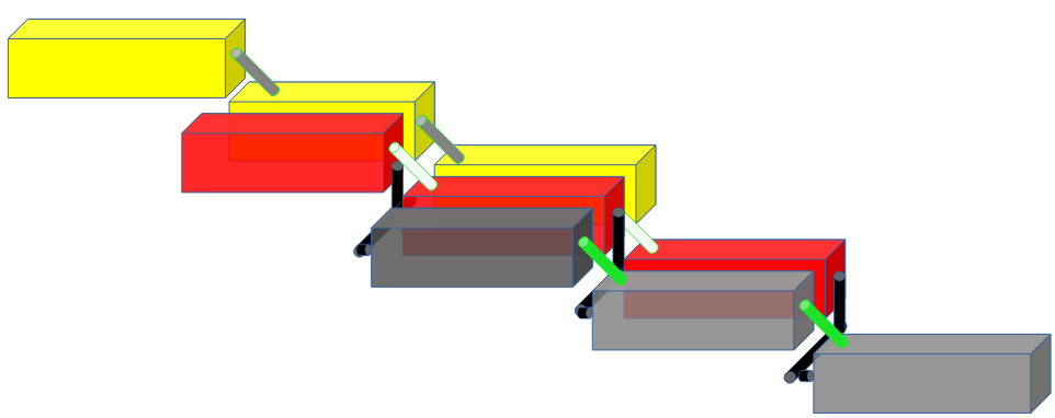
The idea is to think about adding a button under the VIEW option in GanntProject. The button allows us to switch between alternate views. The default view is the normal view like the one shown above. An alternate view continues shows time as X moving left-right, and Y as dependency up-down, but now we add the “Z” dimension that points away from the viewer. Each colored resource gets its own slice in the “Z” dimension. Below is a crude drawing. I think phase 1 is just as shown below which is an isometric view. It has 2d elements that give the impression of a 3d space. Old fashioned video games from the 80’s would use an isometric view because it is simple. If rendered from rear to near, then the elements naturally overlap each other and give the appearance of 3 dimensionality.
A more elegant Phase 2 view would have these as actual 3d objects and if we hold CTRL and move the mouse, we can look at these 3d blocks from different angles. I added colored pipes instead of line arrows to try to show what is connected to what. This 3d view might make it easier to print out a project on fewer pieces of paper.
You actually have got a resource-based view on the tab “Resources”.
And in GanttProject, a single task can hold several resources assigned with different percentages, so the lines would be much more goal-oriented, and not by resource. Think on dependencies of tasks “on the Z-axis”. Would be much harder to see.
Sorry, I am still trying to see the benefit of that visualization feature.